Sunday, March 31, 2013

Typic: Best App Ever!

Hi! So I'm constantly asked what are my fav apps that I currently use in my Instagram posts! And not because she is my absolutely, most favorite person & best friend in this world - we grew up together in Colombia, have been together in the good, bad and mediums, and even though we are thousands of miles away from each other, there is not one circumstance, event, story or momentum that we don't share with each other...this app is pretty crazy cool!

She teamed up with two lovely gentleman and created Typic. A user friendly app that gives you the filters, best fonts out there, borders, and different colors to write messages, love notes, and thoughts on your images! But beyond that it has super cute decor elements that you can add to your messages and your pics {cof, cof that no other app has!}. It is design by designers that completely understand us {artists} our needs and our sensibility for color, type choices and the need for it to be easy, fast and fun to use!

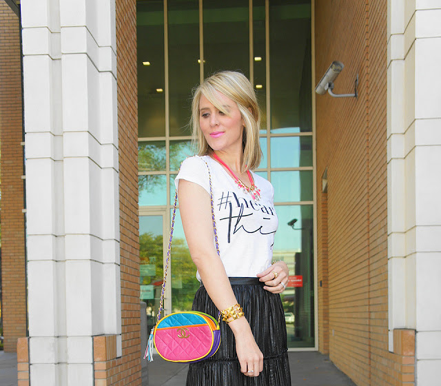
I absolutely love the app and them, plus she is totally rocking the #HeartThis tee! Give this app, and my besti some love, {typic app - download here}! And if you want to see what these creatives are up to, follow them around - pretty fantastic and innovative minds! 

Instagram @TypicAppOfficial  Twitter: TypicApp  Facebook: TypicApp


Super proud of them! -xo luciana

Happy Easter GIVEAWAY


Happy Easter weekend! I hope we all are having a great Easter Sunday! I wanted to share this amazing Etsy shop with the world!!! Handcrafted jewelry, done by Carma - a Southern California {sweetest} girl creating fabulous bohemian - chic jewels. Super delicate pieces that can add a bit of chic and class to your everyday style.  Love the vintage inspiration that comes out from her pieces, perfect to layer them up! Her and I teamed up a couple of weeks ago, and could not waited to share our G I V E A W A Y! 

Carma has been super sweet to give away one of these four pieces to one lucky #HeartThis follower! My absolute most favorite: the shark tooth...love...and covered in gold, love, love, love!

Here are the options :)

Here is how you can enter:

Follow her on Instagram or Facebook 
Re-post the pic that I feature on my Instagram (featuring the #HeartCarmaCollection) and make sure you tags us both: @CarmaCollection@ByLucianaM
I will choose a winner by random on Friday, April 5th at 7:00 PM EST!

Voila:)
You must be a #HeartThis GoogleConnect follower to enter, if you are not, please follow so you can participate:*
Giveaway open only in the U.S. 


Here are a couple of my faves from her pretty Etsy Shop - Carma Collection

Thank you Carma for working with me, and gifting me a letter charm! Can not wait for it to arrive!
Hope you guys enjoy and participate, I'm in love with her work! xo Luciana

Thursday, March 28, 2013

Overexposed: Seoul Fashion Week

After a mesmerizing look at  New York, Milan, and Paris Fashion Week, Vogue.com photographer Kevin Tachman headed to South Korea where he turned his lens on Seoul Fashion Week. From backstage to the center of the action, see his take on this emerging scene. I wanted to pick a couple and share, but honestly I couldn't narrow it down! They are all amazing, spectacular -  I have no words to describe this incredible juxtaposed bridge between photography & fashion! Me quito el sombrero;) XO Luciana


Happy Juicing: Best Habit Ever

Feeling tired and run down? There's been so much buzz about the green juice and the healthy benefits behind it! I have now proved that having this one addition to your daily diet truly has a big impact in your life {it did in mine}

I am not much of a Vegetable lover but I must admit, I'm loving having a juice or two a day!  A friend of mine convinced Nate and I to give this a try, so we decided to commit to it. We bought the - Omega J8006 Juicer -  and it has been the best purchase ever! And also no more migraines for me…ugh if you know what that feels like, please give this a try! I know its a bit expensive of a healthy hobby, but is so worth it, you will not regret it!

SOME FACTS - 
Fresh fruit or vegetable juices are the most nutrient rich health enhancing foods available. They contain an tons of vitamins, minerals, enzymes, proteins, carbohydrates, chlorophyll that both enhance and complement the body and the mind so your body is able to get the most value from them. Because juices are assimilated with very little effort on the part of the digestive system, their nutrients provide a health building impact on the body without taxing the body’s energy.  

6 OF MY FAV RECIPES - 
1. Kale / Carrots / Celery / Watermelon / Oranges      2. Carrots / Tangerines / Apples / Oranges

BlogLovin


Oh this girl! Amazing style, she is the sweeties of all and is wearing those pink plumps soon to be mine:)   Corinne is the author and stylist behind this lovely blog! Tons of fashion and style, on point trands and lovely lovely color inspiration. Check her blog and fab style at the XoTheLookBook! She is also doing a giveaway, check her blog for more info! Hearting you lady, xo Luciana


SmileBabyStudio tee c/o | J.Crew pants | J.Crew Heels | Target purse | J.Crew Necklaces here and here | 
Kate Spade watch | J.Crew Bracelet | Lipstick

Wednesday, March 27, 2013

The Chalkboard #2


The grid =  The structure of design

When most people think about grids, they think about engineering and architecture. However, the grid is an essential tool for graphic design as well. The point of a grid is not as a way to fill up space, but to help you organize the space you have. A grid is a component of the user experience, that is why we do need to talk a bit about this, even thought is not the most glamorous side of design, it is one of the most important ones!

The simpler the grid, the more effective it is. Using a grid is not just about making things be square and line up: it’s about proportion as well. That’s where the “theory” comes into grid theory. It is the concept of dividing the elements of a design. A grid is made up of vertical and horizontal lines and is the foundation of nearly every type of visual media. The structure is there to shape the content into proportions that are pleasing to the eye.  Us humans like when things are in their right place, aligned and straight up. Same does our subconscious, it likes clean straight things, easy to find, read and understand. 

The concept of the grid {alignment} is that everything on a page should be visually connected to something else on the page. Nothing should be placed arbitrarily. When elements are aligned they are connected to each other, even if they are separated on the page. The lack of alignment between the subhead and the related pages or side bar elements will make your eye have to travel across the page, and it was probably enough for you to notice. 


There are many considerations you must take into account before you start arranging a design into a grid ->

What Does Your Fave Instagram Filter Say About You?


Monday, March 25, 2013

Get the best out of your Etsy Shop


This goes for all the Etsy shops/owners and artist out there! Im continually getting the question about any tips on how to promote your Etsy shop, so I thought on sharing and giving some tips on a post for all of us Etsy owners. Level Up your Etsy shop with this tips and start talking with other Etsy shop owners, and showing the world a bit more of your work. So in case you don't know yet, I am myself an Etsy shop owner and an Etsy lover. It's a great place for artists from all around the world to have an opportunity and sell and contributed with others! But your Etsy shop can be much more than your products in a specify internet platform. You are already half way there, you had to create your shop name, a personal description, and a banner. You had made friends, liked and treasured your favorite items. And you have put a lot of work, parts and pieces into to your selling items. So why stop there? Why are you not taking advantage of all that hard work you have done and fully extended for better impact, more sales and artistic recognition?!

That said, here are a couple of tips and ideas to give to your shop. If you are a small business, branding or blogging lover then these tips will be a perfect fit for you!

The Best Easter Treat Ever

StellaMcCartney Easter treat! Completely taken by this app! Love it is so cute and so much fun and an excellent way for the fashion world to encourage us to get our inner-kid in us! Enjoy {app here} Check it out and share with me your Easter egg!


Horoscope Find!


Believe it or not looking for a fun, positive horoscope is not an easy tasks! Theres tons of apps, and Google places to search and read from. But, I had to share this one. My lovelly co-worker at VS sends me mine {im a Virgo} every monday as a little special note and I love it! Refinery 29 presents a weekly horoscope that I just love tons! Don't search anymore and read there weekly advice! We all need a bit of magic in our lives from time to time, right;) ?! Happy Monday - for those who are living close to me and got tons of snow today bundle up, I hope its the last of the season!

Aries (March 21-April 19)
A full moon in your relationship house holds up the mirror. Have you been playing well with others, Aries? Erm…maybe don't answer that just yet. Press pause on your independent efforts and adopt a cooperative approach. Sharing the sandbox can be exhilarating, especially if you find the pail to your shovel. A complementary force can lift a huge weight off of your shoulders by taking up the tasks you’d rather shrug off. 

Sunday, March 24, 2013

PolkaLOVE: Spring '13 Print Collection

Dear PolkaDot: I know you've been around for a bit now, but I still cant get enough of you! That would be my personal love letter to the polkadot pattern creator! Polkadots are so simple but yet so stunning! Spring started last week, and It was time for me to introduce my new Spring '13 Print Collection! Full of golds, neons, pinks, glitter and oranges, and off course polkadots {with lots of love} Yep, all of those things on paper, as prints and wall decor! Re-vant your house and bring a bit of brightens to your walls, closet & little corners! Check out my new prints on my shop {here} - and some other gold finds I'm loving! XO Luciana

Findings: 1 / 2 / 3 / PRINTS / 4 / 5 / 6 / 7


Thursday, March 21, 2013

CASE STUDY: White Space in Design

Hola! This week we talked about white space, the canvas or simply known as negative space. I hope you are starting to see the world a bit different and looking at all the negative space around our environments! Since all we have is to practice, practice, practice to become a master, I thought I would share this amazing design case study. Oriol Gil, created the brand and packaging for Cornelia and Co. A restaurant, bakery, winer and coffee shop in Barcelona. So many details, allowing for space…oh space - to be present, and my fav of all: it's not white;) and the key to their success - it's all branded! Every single piece feels, speaks their brand!
I know this is not particular web/blog design - but its a great example for our week's topic. It is a simple design, full of content - aka: a lot of content does not means it has to be crowded or squished into a design. It is well balanced, allowing it to be readable and pleasant to look at. If you are designing your website, or a post, think in these terms - patterns (rhythm), content quantity (balance) and readability - the most important of all! I hope this is making some sense - as you are learning some design knowledge, I'm practicing some {english}writing skills ;)


Wednesday, March 20, 2013

BlogLovin


Last week I couldn't resist but to share a sneak peek of this project we have been working on for a bit with a couple of my fav bloggers! I love working with the community, share and inspire each other! I'm so excited to share with you all an amazing, dedicated blogger that I #Heart tons! Jen is the writer/stylist for BelleDeCouture - fashion, driven blogger full of tons of inspiration, accents and hot couture! Check her blog out and the giveaway she is having today with the #HeartThis tee!I love her style, her adorable baby girl, and her unconditional support! 


{tee: #heartthis c/o; skirt: Anne Klein c/o *On Sale!; Report bow flats: Victoria's Secret *On sale!; necklace: The Oxford Trunk c/o; bracelets: INPINK c/o & Stella&Dot c/o; bag: vintage} 
P.S. If you are digging this #heartthis tee then be sure to check out my Instagram (@belledecouture/@ByLucianaM) today, as I'll be posting a pic of this tee. If you want to win a tee for yourself all you have to do is:
*Follow her on Instagram: @belledecouture
*Follow my Luciana (#heartthis) on Instagram: @bylucianam
*Re-post the pic that I feature on my Instagram today (featuring the #hearttthis tee) and make sure you mention: #heartthisin your post!
Jen will choose a winner by random on Friday, March 22nd at 7:00 PM EST!

Tuesday, March 19, 2013

THE CHALKBOARD #1


Are you ready, because we are about to get into a pretty cool world full of some {nerdy-design} knowledge! If you are a brand new blogger, or have been for a bit but want to spice up your visual brand and your posts - welcome to The Chalkboard. Graphic design can have an awful lot of definitions, but above all, it responds to the needs of one's personal and public voice. It is a combination of many elements that come together on the paper, the screen or the canvas—in design words, the "space."
Space, sometimes known as the art of nothing, negative space or simply the background, is the canvas you sit in front of when you are about to create some visual communication content. It represents the absence of text and graphics but is the responsible for these to be unified. It provides flow, breathing room and a happy balance for your eyes {and your heart}. When you're in need of some visual peace and a better understanding of why your elements are not adding up, introduce white space. Space will help create a less confusing, less overwhelming visual. Most importantly, it allows the viewer to focus, {let me repeat that} focus, on something specific.
People tend to ignore the white space, not knowing that the design has already begun just by defining your frame of work. We need to start training ourselves to love the white space, and adopting it as part of a design. Two little misconceptions: 1) It is definitely not wasted space, 2) it does not have to be white!

Before we get a bit nerdier ;) let's make sure we all align on some concepts. White space is found in any design media web design, illustrations, abstract artwork or photography. Also known as Negative space, its most evident when seen as the space around a subject, and not the subject itself, when it forms an interesting/artistically relevant shape! It is a key element of the composition. For us bloggers, and social media lovers, it is crucial because we have less than a second to grab our readers attention and white space can be our partner in doing so. 

White space responsibilities

TRENDING: Celestial Stars

Couldn't be a better time to continue talking about stars and signs and my cosmic delight! I've been loving this {ready to merge into our lives} celestial star trend for these past couple of days, and since we talked about it earlier- hey, why not add some styling love to it! I'm loving all of these picks - obsessed with the WildFox Seeing Stars Lennon Sweater #3, and need that royal blue scarf #4, because this cold weather is going no where! Some shine and starry prints can't never hurt your closet, nor your soul, right?! Loving this new trend - makes my heart super happy for some reason!
From left to right - 1 / 2 / 3 / 4 / 5 / 6 / 7 / 8 / 9 / 10 / enjoy:) xo - luciana

DISCOVERING: Elisa Werbler - The Birthstones

Im not sure if I've express how much I love zodiac signs and eveything and enything that relates to the cosmis world - hint my love for the univers in my prints and quotes. I'm so happy I run into these beautiful color print series of  The Birthstones, by Elisa Werbler. Loving all the colors, and the settle tones she uses to create depth, shape and dimension! Loving and totally want one for my apartment, and my spring cleaning, revamping decor mission! When is you birthday, and do you know your birthstone? I am a September child, Virgo to its fullest and my birthstone is the Sapphire:)


Monday, March 18, 2013

THE CHALKBOARD: Design, For Non Designers


I've heard all throughout my career that in order to design well, one must understand their audience and remember that not everyone is a designer. Making an impression and getting a response out of people is not an easy task. But that is what design is all about. Nevertheless it's an art that can be learned and understood. In that light, I want to share my experience and highlight how following a few simple guidelines can allow anyone to come up with a very clean, fresh, functional and better yet attractive designs!

If you've known me for a bit, you probably know I'm a happy blogger and absolutely LOVE reading other blogs. I believe that blogging is a powerful medium to bring fresh perspectives, innovating ideas and a great place to start conversations with people just like you {and me}! Regardless of the subject, passion, love or expertise, EVERY blog, post, or simply love note should be visually balances and brand appropriate. It's amazing how a few simple things can provide a great foundation and allow anyone to come up with a great designs that make sense and look great!


I want to share my knowledge with everyone so you'll have an easy DIY design manual for creating your own blog, posts, giveaways/communication pieces or improving upon what you've already started. In the following posts I'll go over each of the following so we can work together in the process of building a better {prettier} blogging community.

• Space: The art of nothing • The Grid: Think in shapes • Color: Break some rules • Visual Dominance: Focus on what matters most • Typography: Giving type a voice • Fonts: Navigating through the 1000's to find clarity • Bitmap Images: It's all about the pixels • Photo tricks: In case your blogging with your smartphone • ...and some sprinkled surprises;)

Can't wait to share, hope you join, and find some useful tips and tricks in the upcoming weeks. We can all beneficent for some graphic inspiration in our life's & in our blogs right?!
Stay tune for more:) xo - Luciana!


Sunday, March 17, 2013

#HeartThis Tee

Hi, what better inspiration than our own surroundings! I couldn't help it but to share the makings of a soon to be baked project! Im super excited for this to happen, plus it will be a perfect match for a spring welcoming  {much needed warmth} ! Love this Instagram little recap of my messy but so happy studio this past couple of days, I love the {visual} story that it creates and cant wait to partner and link it up with friends; plus have you guys share & see some images of your own! Some hashtag tees, pretty packaging, glitter tape and tons of love notes all invaded my space:) More info on this little project/ giveaway to come soon - stay tune:)


Click bellow to enter your pic, join me, and share with me your style #HearThis tee:)

Saturday, March 16, 2013

Bye Bye Google Reader - Alternatives?


It is a real sad news to hear that google reader is coming to its end! Honestly, I'm having a hard time understanding why they would want to get rid of some serious archiving system! Sad but true, but also happy to see that people want to be heard and a petition was created - check it out here -

Oh well, not the first time technology is asking us to adapt to change! If you are looking for an alternative here are my two recommendations - Feedly - on the left & - NewsBlur - on the right. Give these I try, they are new platforms but is nice to know we have some alternatives.


I hope we keep connecting and sharing through these new platforms. And you keep reading some #HeartThis. You can also stay tune through {Facebook} {Instagram} {Blogloving} or an RSS Subscription. Sometimes I do smile at being able to live through time/social changes. I think is so interesting and fascinating, can't wait to hear what is Googles reason for this; a good one has to be don't you think so?
xo - luciana

Wednesday, March 13, 2013

Jacob's Diet Coke Designs

Polka dots and bows for coke! I love this news - Fashion designer Marc Jacobs has created three can designs for Diet Coke, one to celebrate each decade since the drink was launched 30 years ago. Keep posted since all three designs will be available on cans and counter bottles nationwide from February 25, and all will feature an exclusive code for the chance to win a Marc Jacobs tote.

I Heart ‘80s’ embodies the rise of the empowered woman in all her glory, while ‘I Heart ‘90s’ when extravagant attitude of the era where fashion, music and art collided in a glamorous exploration of strong femininity and daring attitude, and ‘I Heart ‘00s’ is a playful and lighthearted illustration of the sporty-cool decade, embodying humour, sexiness and energy. Totally in love with the "80's one!

“I feel very privileged to be the new creative director of Diet Coke and put my stamp on the 30th Anniversary campaign,” says Jacobs, “Diet Coke is an icon… and I love an icon.” Super cool, not to say awesome hilarious video they did to celebrate Coke's anniversary! I mean how much do you love these and want to buy one?! 

Monday, March 11, 2013

DISCOVERING: Lola Donoghue

Check out this pretty insightful story written by herself: Lola Donoghue . I love when we can learn where the art comes from, why and how it has matured to reach the place is at! Loved, loved her, and her amazing work! Makes me feel super happy and at peace, not to say reminds me of some sunny days, right? is it just me, or she truly expresses a mix of pace-full happiness?!
My name is Lola Donoghue, and I’m a painter and illustrator. You can find my paintings in my shop, Lola Donoghue. I also run the shop Art by Lola, where I sell my fashion illustrations.
I began my creative journey at the Limerick School of Art & Design. I graduated at the top of my class with a first class honors degree (much to my very pleasant surprise!). I began teaching shortly after, and became a partner in a photography business about five years ago. With the crazy schedule of two full-time jobs, I lost touch with my own art and have only begun painting again in the last couple of years (thanks to a good kick in the behind from my boyfriend).