Showing posts with label Design. Show all posts

Wednesday, August 21, 2013

S/S13 Fashion Pops

This is a collaboration in progress with a high fashion department store in the U.A.E., inspired by the most iconic S/S 13 fashion collections and the summer popsicle fad. 

After choosing popsicle shapes and colours that resemble the collections closely, we transformed what we saw into matching flavours to accessorise the fashion pack of Dubai throughout the hot summer months. These popsicles would be available at various pop-up shops and popsicle vans parked in popular spots.


Monday, July 8, 2013

Exhibition A’s Bill Powers on Affordable Art

06/17

I am absolutely in love with this interview! Happy monday:*
art is expensive. we know. we checked in with Bill Powers, a co-owner of online art gallery Exhibition A who is committed to making art buying less intimidating and more accessible. here, Powers talked to us about his first visit to the Metropolitan Museum of Art, his signature rose-tinted glasses and why you just might find paintings hidden at the back of his closet…


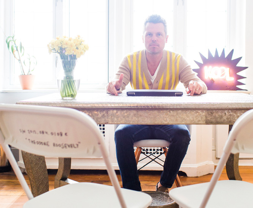
Bill Powers is photographed in Half Gallery, a new uptown space he moved into in February. (It doubles as the office for Exhibition A.) He wears his own custom Mr. Powers cardigan, Levi’s 502 jeans, and loafers he picked up at Dick’s Sporting Goods. “My wife likes to tell people they’re Margiela,” he jokes.


How long have you been involved in the art world? 
I opened Half Gallery in 2008 and then cofounded Exhibition A in 2010, but I had been writing about contemporary art since the late ’90s for publications like the New York Times, Details, Paper, Muse and Purple magazine.

Were you exposed to a lot of art as a kid?
My mom took me to see the King Tut show at the Metropolitan Museum of Art when I was in third grade. Does that count?

Where did the name Exhibition A come from?
I was thinking about that Andy Warhol book A Novel—Google the cover image—and also the play on words with ‘exhibit A,’ the way they introduce evidence in bad courtroom dramas on TV.

You and your wife, Cynthia, are big collectors. How does that process work for the two of you? Do you both buy what you love? Or is it a compromise?
Cynthia went to art school in Chicago, so that’s her first love, even before fashion. In terms of collecting, I sometimes borrow a page from my friend Andy Spade’s playbook: he buys a painting and puts it in a closet until his wife finds it later…


Is it true that when you launched Exhibition A, one of your goals was to make buying and collecting more approachable, no matter what one’s background was?
Yes, that’s exactly right. Today, auction houses and major galleries often sell artwork off jpegs they email to collectors, which can be scary when you’re talking about a million-dollar John Currin painting, but less so if it’s a five-hundred-dollar print by Rene Ricard. Exhibition A makes art approachable without dumbing it down. We consider ourselves an online art adviser.

How do you approach the network of artists and people you work with on Exhibition A?
We like to mix in established talent with more emerging names to keep things fresh. I find that art fans in general have a deep curiosity, so I like to imagine that our base is down to discover new creative voices with us. 

Tell us about a few artists you’ve featured on Exhibition A who have knocked it out of the park.
Aurel Schmidt has a big following already, but when her print of a flower in an empty beer can sold out in one day, I was shocked at the demand was for her work. Ditto with Wes Lang. My biggest honor to date was working on an Exhibition A print with Richard Prince, who’s been an art hero of mine from day one.
---


CFDA/Vogue Fashion Fund runner-up Tabitha Simmons, the English-born shoe designer and stylist, invited us to her Chelsea studio to reveal an envy-inducing number of shoes and a little boy’s hat made of vintage Cracker Jack charms that was totally, well, charming.

Tuesday, June 25, 2013

How to build an Edison Lamp

I have been complete obsessed with the Edison hanging lamps concept, and in the continuings of revamping my home, I want to incorporate this to it! But they are wayyyy to over price, so I found this really cool tutorial on how to build an Antique Fixture for under $25! Super excited will be making soon and sharing my own antique edison lamp! 


Unfortunately, high demand leads to inflated prices. Any simple fixture that claims to be “antique” or “vintage” costs a premium. Some are worth the price, but we’ve seen simple antique pendants out there going for over $100, when the raw materials to build the fixture cost under $25. 

The following guide will show you how to build your own antique swag light fixture in less than 10 minutes with materials you can buy for about $25, including the bulb.
Needed Materials:

(1) dimming brass socket - $10.00
(1) EZ grip antique plug - $1.50
(1) antique light bulb - $5.00

Needed Tools:
A flat head screwdriver
A set of wire strippers
A pair of scissors


Wednesday, May 29, 2013

SHOP STOP : MYTH & SYMBOL – HOUSTON, TX


One of my favorite things to do when just killing time is browsing my favorite online haunts on a little virtual shopping spree.  Myth & Symbol, although a brick and mortar store located in Houston Texas, is one of my absolute favorites.  The ladies behind the shop are sisters, Chau and Trang Nguyen, who are just as sweet as can be.  I’m hoping to physically make it to Myth & Symbol someday soon, but for now I’m just delighted to wishlist just about everything from their online shop.


Wednesday, May 8, 2013

Spring - Desk Decor

Re group your energies and get back to it! Summer is the best time to blog write and get inspired and inspire others of course! Check out these cute items currently on my cart {wink, wink} - for motivation and creative energies to set back into my studio! It's easy to let go, but don't let it happen, remember why in the first place you got into writing, blogging or creating - or whatever project you are into! So what ever it is, get inspired, and gift your self a little something that will make you commit with your own self on the project you are working on, and remmeber why you started it and how happy it makes you! Besos, Luciana


1/ Must have books for inspiration 
2/Plants, tons of green to take care of all the rays from the technology 

THE IMAGINARIUM OF KATIE NEHRA

I run into this amazing little interview of Katie Nehra. Got me inspired for the day, and excited about her perspective on imagination! Not to say her fabulous home, decor and style!

THE DOSSIER: NAME: Katie Nehra. TRADE: Actress/Writer (currently working on a feature film with actor/director Chris Messina (The Mindy Project), plus a pilot for FX). Designer of the cult leather jacket line Simone, beloved by no less than Patti Smith, Mary-Kate Olsen, and Nicole Richie. VIBE: Whimsical with an edge. ABODE: A Normanesque two-bedroom apartment in West Hollywood, CA.

“I don’t think most people let their imaginations run as wild as they should,” actress, writer, and fashion designer Katie Nehra tells us up front. “So I try to do that where I live.” The contagiously bubbly Nehra fills us in on her modus operandi while sitting beneath a pair of John Derian flamingo heads, sentries in a dining room whose centerpiece is a monumental concrete-topped custom table from Mecox Gardens, set amidst a “very Miami” day-glow rose painted backdrop.

HAPPILY EVER AFTER Fairytale anxiety notwithstanding, Nehra’s happiest place on earth just might be her living room: “I find it hard when I’m out all day and I come home—I don’t want to go out again because it’s so nice in here,” she sighs. A faux zebra rug dominates the salon, punctuated with a raspberry Louis XV throne from Dragonette, a pair of 19th-century silver-plated lamps from Bourgeois Boheme with custom vermilion shades, and the glint of Kiki de Montparnasse handcuffs, placed just-so atop an issue of Paris Vogue. “Two of my girlfriends gave these to me for my birthday last year,” she says. “I keep them out like an art piece—but they can be used for other things,” she adds with a wink.


Wednesday, May 1, 2013

31 Ways to Refresh Your Home

Hello! As I take on some Spring refreshing at home - I thought of sharing some new decor! I love to constantly spice up my art wall and add new good vibes to my home! Can't believe I had the courage to do this! Every day I will be designing a new print, only available for that day - like a daily print deal;) they are 5 x 7 so its just like giving an accent to your wall! I hope you enjoy I will be posting and showing them on my Instagram  - Facebook and here off course! Feel free to send me any ideas, notes or just a hello! Oh and for all the fashion lovers, enjoy some fashion trends on paper form;) Feel free to pas this along and share with your friends in need of some decor - art - love!


Wednesday, April 24, 2013

Brickyard Buffalo Pop-Up Market

Morning! I recently stumble upon this amazing site! BrickyardBuffalo an online pop-up market that showcases individual companies and their freshest items! They have been super kind and fun to work with! They contacted me and I'm so happy to have said yes! We did a gold foil deal running until next Tuesday so check it out! But apart from some #HeartThis prints, check all the cute, cute stuff they have daily for deals! Also I love that they don't blast you with 10 emails a day! Feels super casual, and respectful, loved, loved what they have going on! Good job BrickyardBuffalo! xo Luciana

Definitely made one big happy designer:  Me!


Monday, April 22, 2013

Happy Earth Day | Macrame Pot Holders DIY

Yei Happy Earth Day! What better way to celebrate than with some plant love! Ive been crazy for these macrame pot hangers and totally decided to make some for the inside of my studio! This is a DIY I found at Refinary 29, I will take pics and share mine when completed, but buy the time I get home today to make tons, earth day would be over! So thought to share this one that thought it explained everything great and I will be following this afternoon! 

Also loving some by my Etsy family - Modern Geometric Macrame PlanterSmall Neon Macrame  - and this Beige Macrame Plant Hanger! In case you fall in love with them as much as I am, and just want to buy some!


Give thanks to earth and appreciate all the wonderful corners it has giving us in the world to dream about and wish upon! Hope its sunny wherever you are xo Luciana

Monday, April 15, 2013

DIY | ‘Bipyramid’ Tutorial

The shape of this geometric origami is called ‘Triangular Bipyramid’. I am obsessed with these little bipyramids! The origami itself is the easiest to make but the uses are so much funner! To remember this name is actually straight forward. Bipyramid means two pyramid shapes mirrored back to back, and this pyramid has triangular sides, so there you go!

Friday, April 5, 2013

Spring/Summer Prints and Pattern Trends

Yei happy Friday! What a long week! But its over and now the weekend my favorite of all! And as a celebration for such I thought to share some of my favorite upcoming trends and visions on some spring/sumer prints and fabrics! Luxe natural fibbers, a focus on linen and indigo, crisp handles, dimensional structures, and marbled color were some of the key messages from Première Vision this season. Trends are one of my fav topics because is the mix of society and design, fashion and the everyday life!!! Here is my preview of what is coming up! Have a great friday and weekend, and stay on the look for some of these prints! xo Luciana

Blurred

Carnival tropical

Mineral

Wednesday, April 3, 2013

Kate Spade: Saturday

Good Morning! Today I got some breakfast, sat on my desk, when through a couple of emails, and then this email pop on my screen, and made my day! Oh dear Kate, how I love you! The print, the colors and the strokes are amazing, but then when I clicked on it, it took me to this quick short visual story on how they had made the prints they have on their products! So genius, and cute and amazing! Love how they allowed us customers to be part of their process and their brand! Loved! Check it out {here}. Shop their collection {here}.

Monday, April 1, 2013

PhotoJojo University: April Free Class


I came across this lovely platform the other day: Photojojo. For us phone lovers, and photo addicts, it is a one month course, where they send you email weekly lessons on how to use your smart phone photo app wisely and take better pics. Super fun, you would think its common sense knowledge but not really! They teach you fun tricks that our phone brands don't really share with us! 

I wanted to gift this course to the first three peeps that comment underneath - I will close it in 48h. You get to pick your professor between Professor Pancake, Professor PJ and Basket of Kittens. Mine was professor was Professor Pancake, and I end up in love with him -

Write me a note underneath and I will register you to get this class for free for the month of April! I think we can all learn a trick or two about the photo world right?! Happy Monday! xo luciana

Sunday, March 31, 2013

Typic: Best App Ever!

Hi! So I'm constantly asked what are my fav apps that I currently use in my Instagram posts! And not because she is my absolutely, most favorite person & best friend in this world - we grew up together in Colombia, have been together in the good, bad and mediums, and even though we are thousands of miles away from each other, there is not one circumstance, event, story or momentum that we don't share with each other...this app is pretty crazy cool!

She teamed up with two lovely gentleman and created Typic. A user friendly app that gives you the filters, best fonts out there, borders, and different colors to write messages, love notes, and thoughts on your images! But beyond that it has super cute decor elements that you can add to your messages and your pics {cof, cof that no other app has!}. It is design by designers that completely understand us {artists} our needs and our sensibility for color, type choices and the need for it to be easy, fast and fun to use!

I absolutely love the app and them, plus she is totally rocking the #HeartThis tee! Give this app, and my besti some love, {typic app - download here}! And if you want to see what these creatives are up to, follow them around - pretty fantastic and innovative minds! 

Instagram @TypicAppOfficial  Twitter: TypicApp  Facebook: TypicApp


Super proud of them! -xo luciana

Monday, March 25, 2013

The Best Easter Treat Ever

StellaMcCartney Easter treat! Completely taken by this app! Love it is so cute and so much fun and an excellent way for the fashion world to encourage us to get our inner-kid in us! Enjoy {app here} Check it out and share with me your Easter egg!


Sunday, March 24, 2013

PolkaLOVE: Spring '13 Print Collection

Dear PolkaDot: I know you've been around for a bit now, but I still cant get enough of you! That would be my personal love letter to the polkadot pattern creator! Polkadots are so simple but yet so stunning! Spring started last week, and It was time for me to introduce my new Spring '13 Print Collection! Full of golds, neons, pinks, glitter and oranges, and off course polkadots {with lots of love} Yep, all of those things on paper, as prints and wall decor! Re-vant your house and bring a bit of brightens to your walls, closet & little corners! Check out my new prints on my shop {here} - and some other gold finds I'm loving! XO Luciana

Findings: 1 / 2 / 3 / PRINTS / 4 / 5 / 6 / 7