Showing posts with label The ChalkBoard. Show all posts

Wednesday, March 27, 2013

The Chalkboard #2


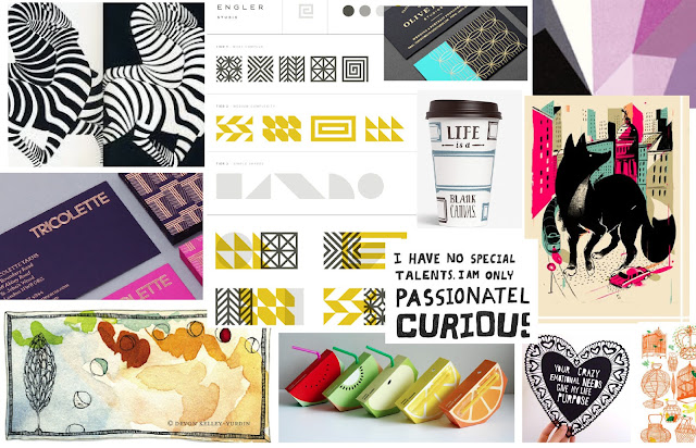
The grid =  The structure of design

When most people think about grids, they think about engineering and architecture. However, the grid is an essential tool for graphic design as well. The point of a grid is not as a way to fill up space, but to help you organize the space you have. A grid is a component of the user experience, that is why we do need to talk a bit about this, even thought is not the most glamorous side of design, it is one of the most important ones!

The simpler the grid, the more effective it is. Using a grid is not just about making things be square and line up: it’s about proportion as well. That’s where the “theory” comes into grid theory. It is the concept of dividing the elements of a design. A grid is made up of vertical and horizontal lines and is the foundation of nearly every type of visual media. The structure is there to shape the content into proportions that are pleasing to the eye.  Us humans like when things are in their right place, aligned and straight up. Same does our subconscious, it likes clean straight things, easy to find, read and understand. 

The concept of the grid {alignment} is that everything on a page should be visually connected to something else on the page. Nothing should be placed arbitrarily. When elements are aligned they are connected to each other, even if they are separated on the page. The lack of alignment between the subhead and the related pages or side bar elements will make your eye have to travel across the page, and it was probably enough for you to notice. 


There are many considerations you must take into account before you start arranging a design into a grid ->

Thursday, March 21, 2013

CASE STUDY: White Space in Design

Hola! This week we talked about white space, the canvas or simply known as negative space. I hope you are starting to see the world a bit different and looking at all the negative space around our environments! Since all we have is to practice, practice, practice to become a master, I thought I would share this amazing design case study. Oriol Gil, created the brand and packaging for Cornelia and Co. A restaurant, bakery, winer and coffee shop in Barcelona. So many details, allowing for space…oh space - to be present, and my fav of all: it's not white;) and the key to their success - it's all branded! Every single piece feels, speaks their brand!
I know this is not particular web/blog design - but its a great example for our week's topic. It is a simple design, full of content - aka: a lot of content does not means it has to be crowded or squished into a design. It is well balanced, allowing it to be readable and pleasant to look at. If you are designing your website, or a post, think in these terms - patterns (rhythm), content quantity (balance) and readability - the most important of all! I hope this is making some sense - as you are learning some design knowledge, I'm practicing some {english}writing skills ;)


Tuesday, March 19, 2013

THE CHALKBOARD #1


Are you ready, because we are about to get into a pretty cool world full of some {nerdy-design} knowledge! If you are a brand new blogger, or have been for a bit but want to spice up your visual brand and your posts - welcome to The Chalkboard. Graphic design can have an awful lot of definitions, but above all, it responds to the needs of one's personal and public voice. It is a combination of many elements that come together on the paper, the screen or the canvas—in design words, the "space."
Space, sometimes known as the art of nothing, negative space or simply the background, is the canvas you sit in front of when you are about to create some visual communication content. It represents the absence of text and graphics but is the responsible for these to be unified. It provides flow, breathing room and a happy balance for your eyes {and your heart}. When you're in need of some visual peace and a better understanding of why your elements are not adding up, introduce white space. Space will help create a less confusing, less overwhelming visual. Most importantly, it allows the viewer to focus, {let me repeat that} focus, on something specific.
People tend to ignore the white space, not knowing that the design has already begun just by defining your frame of work. We need to start training ourselves to love the white space, and adopting it as part of a design. Two little misconceptions: 1) It is definitely not wasted space, 2) it does not have to be white!

Before we get a bit nerdier ;) let's make sure we all align on some concepts. White space is found in any design media web design, illustrations, abstract artwork or photography. Also known as Negative space, its most evident when seen as the space around a subject, and not the subject itself, when it forms an interesting/artistically relevant shape! It is a key element of the composition. For us bloggers, and social media lovers, it is crucial because we have less than a second to grab our readers attention and white space can be our partner in doing so. 

White space responsibilities

Monday, March 18, 2013

THE CHALKBOARD: Design, For Non Designers


I've heard all throughout my career that in order to design well, one must understand their audience and remember that not everyone is a designer. Making an impression and getting a response out of people is not an easy task. But that is what design is all about. Nevertheless it's an art that can be learned and understood. In that light, I want to share my experience and highlight how following a few simple guidelines can allow anyone to come up with a very clean, fresh, functional and better yet attractive designs!

If you've known me for a bit, you probably know I'm a happy blogger and absolutely LOVE reading other blogs. I believe that blogging is a powerful medium to bring fresh perspectives, innovating ideas and a great place to start conversations with people just like you {and me}! Regardless of the subject, passion, love or expertise, EVERY blog, post, or simply love note should be visually balances and brand appropriate. It's amazing how a few simple things can provide a great foundation and allow anyone to come up with a great designs that make sense and look great!


I want to share my knowledge with everyone so you'll have an easy DIY design manual for creating your own blog, posts, giveaways/communication pieces or improving upon what you've already started. In the following posts I'll go over each of the following so we can work together in the process of building a better {prettier} blogging community.

• Space: The art of nothing • The Grid: Think in shapes • Color: Break some rules • Visual Dominance: Focus on what matters most • Typography: Giving type a voice • Fonts: Navigating through the 1000's to find clarity • Bitmap Images: It's all about the pixels • Photo tricks: In case your blogging with your smartphone • ...and some sprinkled surprises;)

Can't wait to share, hope you join, and find some useful tips and tricks in the upcoming weeks. We can all beneficent for some graphic inspiration in our life's & in our blogs right?!
Stay tune for more:) xo - Luciana!